Dear Tanglers,
last week we discussed the fact that the direction of the lightsource doesn’t matter in Zentangle – even though some patterns seem to be “impossible” when you look at them closely.
“But doesn’t that look wrong?”, you might have asked yourself.
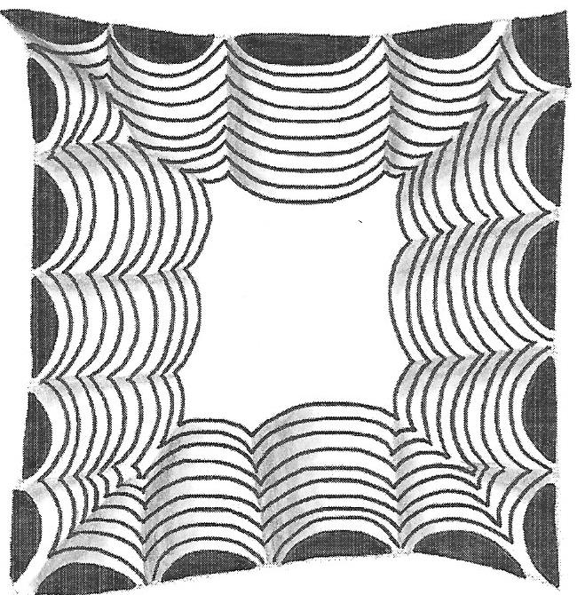
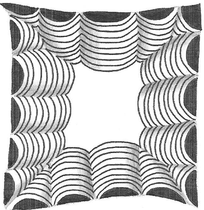
To answer this question I would like to show you two pictures. Below, you see the pattern Crescent Moon – one of Zentangle’s classic beginner patterns. I’ve shaded this pattern in two different ways – one “correctly” and one Zentangle style. Can you tell the difference?
Well? If you’ve had experience with realistic drawing, you might have spottet the difference. But how long did it take you? And if you hadn’t known that one of them was “wrong”, would you have noticed at all?
What am I trying to say?
Let me first give you the solution: The top picture shows the “realistic” lighting. The light source would be on the bottom right. But it’s not always easy to shade this way – and I’m not sure if I did everything right.
For the bottom picture I chose to ignore “wrong” and “right” and just shaded all the tunnels on the right side. If you think about it, this lighting is impossible, because there seems to be a different light source for each side of the pattern. The amazing thing is, though: The effect is the same!
So this means that it’s really not so important whether the shading is done “correctly” or not. In either case it looks stunningly three-dimensional. And isn’t that what we’re after?
Have plenty of fun shading and see you next week for the Pattern Mixer!